Monday, December 7, 2015

Discipline is Instinct's Cure

Final statement from the printmaking class this semester + results:

It has become increasingly interesting to me to see how the contrasts of order and entropy seem to play out both in my mind and in the world. When something negative happens, there seems to be two options.  One is to quickly and forcefully snuff it out. The other, more effective option, I have seen, is lasting change happens through thoughtful, consistent, steady actions. In relationships and on the news, consistency without lashing out has worked to promote harmony. Discipline becomes instinct’s cure.

In all of the pieces, firearms represent quick, chaotic, and forceful action, while the agricultural tools, like the practice of farming, show patience, consistency, and longevity. With this combination, I am subsequently alluding to the “swords-into-plowshares” of the book of Isaiah, turning weapons into tools for bearing fruit. I intersperse tight, rigorous lines indicative of Gothic cathedrals and pilgrimages against the chaotic smatterings of quick or inherently messy applications. No one side is totally winning in each piece. In line-driven work like the etching, there are scratches and uneven type. Order reigns through tight, crisp line, but it still retains smudges and scratches. The trace-drawing works in the same way, where symmetry is king, but it is soiled by cracks and noise. In the rougher reductive monotypes, where a rawer application is inherent, the guns are still compartmentalized and separated by color, implying order. The collagraphs act like the etching in their crispness and composition, being static and symmetrical, but they nonetheless have discord in their ink-smattered insides, where there is less control on the artist’s part. Color works to separate in the reductions, but more to unify in the trace drawing. However all of the color is to be reminiscent of the gothic-era stained glass windows, adding to the religious theme moving through the pieces.




Tuesday, September 22, 2015

Monotype

Additive


Subtractive


Trace Drawing


Sunday, September 13, 2015

Display and Surrender pt.II


I have made the argument before that sometimes the visual of an action holds more value than its monetary worth. Here is yet another example...

In 1989, Kenyan President Moi acquired some 12 tons of illegally poached elephant tusks from his predecessors. Of course wanting to end the trade, he was advised to sell off the ivory and make $3 million to fight poaching. Nope. He had all of it stacked in a huge mound and burned. News media covered it and people paid attention. It set off a barrage of other nations to light their own elephant pyres and set a ban on the trade of ivory in Kenya. Had he sold it all and spent the money to buy new equipment and staff, there wouldn't have been the loud resolve that the burning had. The resolve was worth more than the money.


For extra info, go to RadioLab's podcast "The Rhino Hunter"

Matter Matters/Work is Hard


This past June I began working with Treehouse Design Company here in Memphis. I came in as an intern, helping out in the construction and design of the current build, a three-story metal clad treehouse. I have definitely learned some things about the nature of work and the importance of the physical presence of things.

The work is hard. No matter how hard or efficiently or thoughtfully I try to install a window frame, the process always turns out being twice as long as you thought and the frame winds up slightly crooked. There's a deep, almost blatant struggle between me and the materials. Much of the time, we leave the worksite not because we accomplished everything we set out to do, but because we are too tired to continue.

Yet some days I would come down from the scaffolding and displace myself from my labor to notice a looming, beautifully shining structure perched there in the woods. There is a contrast of Galvalume against hackberry, uninterrupted against fractured, geometric against organic to produce tension that every human who saw it needed to deal with. We had created a physical, lasting object of beauty.

I would put forward that in no other place of work are the cultural mandate of Genesis 2 and the fact that work is now cursed from the fall more equally apparent than in the act of physical creation. We were made to work, the Bible says, perfectly and without sin, to build, grow, and progress culture for human flourishing. Building beautiful things excellently does this. Yet the fall in Genesis cursed that endeavor. The work becomes hard and sometimes fruitless. The tension is hard to grapple with.

Yet when I look at the mandate and then back at my work there is a great truth.. We are told to hold dominion over the earth, to subdue it, to bring order. I find that as a gardener prunes weeds to allow fruit to grow, so I build beautiful things with material that, without my intervention, would not exist. We bring order to chaos. As God did when he created everything, so we also collectively arrange disorder into something that is good and glorifying.


SIDE NOTE:
Heres some extra neat things we've been working on.
T-Shirt design

SketchUp rendering of Pod-2. The Treehouse Guys of DIY network are coming to help us build it. YAY CABLE TV.

Rendering of St.Jude Byrd House in Bristol, Tn. Yes that is a real NASCAR coming out the side of that wall.


Monday, April 27, 2015

The Discipline of Beauty

During the frantic endeavor of trying to make a perfect composition for the outdoor sculpture, I slowly became troubled. The more and more I worked, it seemed, the worse and worse my ideas became. I had a general idea of what I wanted to do, but even it wasn't as fulfilling or exciting as I had been hoping. For several weeks I have been learning new skills, which is great obviously, but I think I made the mistake of relying on skill acquisition to be in itself my perception of good creation. Essentially, I became so worried about how to weld, cut, grind, balance, and every other non-intuitive thing you can do to metal that I forgot how to make things look beautiful. And not just having a pretty weld.

I realized this when, through a friend, I came across the work of Andrew Hayes.


Bold, beautiful lines of steel combine with the lilting pages to create simple, yet totally profound, visual statements. The steel is the flimsy pages' antithesis, warping itself around the other. There is nuance and subtlety, yet almost a violent contortion of the book that becomes essentially another medium. All without anyone paying attention to the impeccable forging and welding it took for the viewer to even see these things clearly.

EH-HEM.. Pardon the drool..

It was my response to this work that was most intriguing. To be honest, this work isn't even earth-shatteringly contemplative, it's just darn pretty. I feel like I recognized beauty in a sculpture for the first time in a long time without thinking about how it was made. This drove me to look at other work, not for it's techniques, but for it's aesthetics.

So I went and found 30 artists to observe. I needed more examples of beauty; to fill up my visual tank, if you will. It was very similar to reading the Word. Sometimes you get excited about God, so you read the Bible, and sometimes you know you aren't relating with God in the way He intended, so you read. I would never call art God, but this process showed me the value of spiritual discipline. I couldn't pour out without being poured into. I thank God He's used work to sanctify me in that way.


Saturday, April 18, 2015

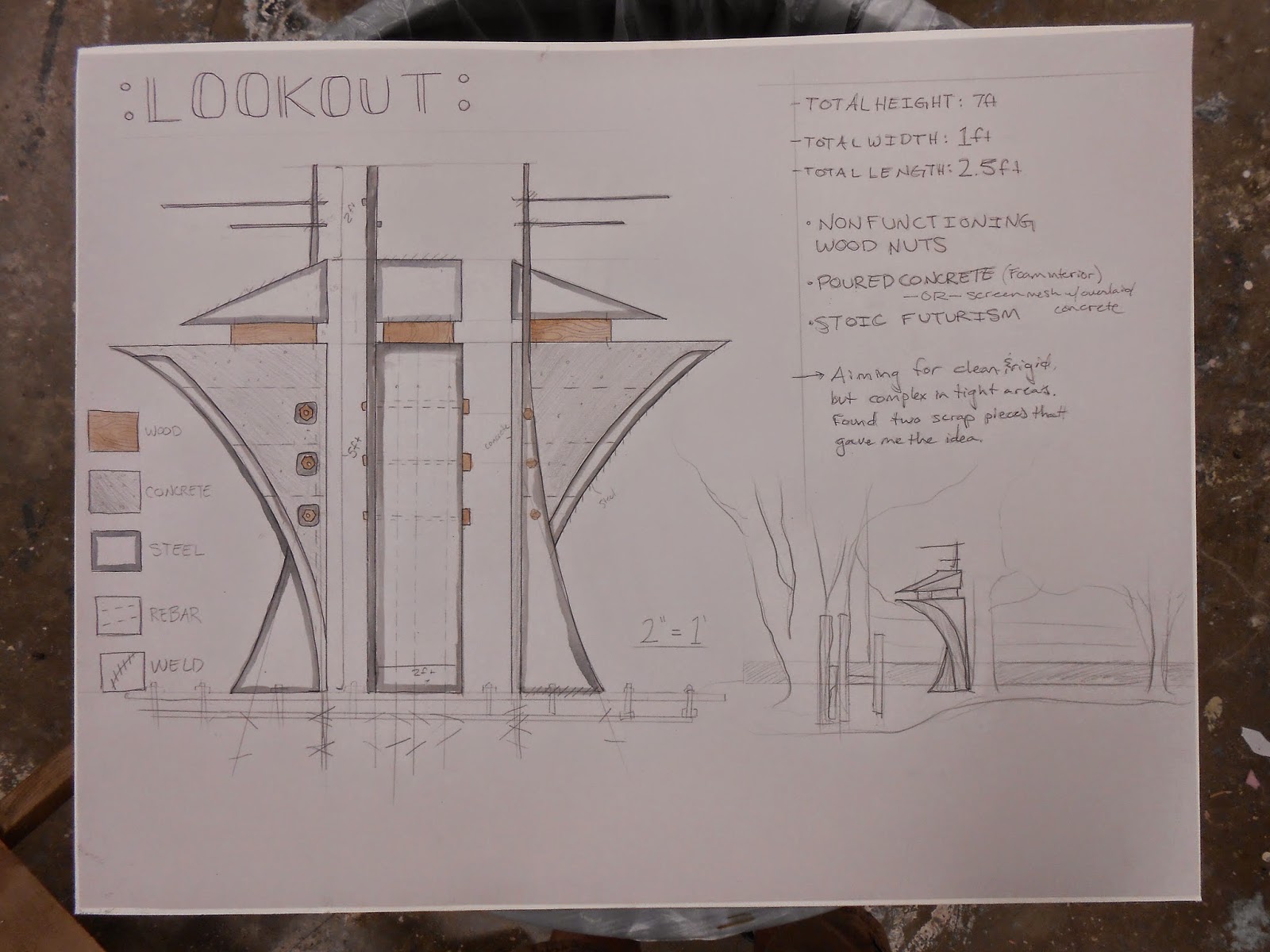
Outdoor Sculpture Plans: The LookOut

For our final project, we have to make a large-scale outdoor sculpture. I absolutely love outdoor work because it becomes a free-to-the-public, educational monument for folks to gawk at. Love it. So when the opportunity came, naturally I became frazzled and hit an artist's block.
It started with a handful of sketches and thoughts ranging from my long stood by gothic-style stuff to the modernish work that already exists outside the school..
 
It was decided that I would do a version of the clean, polished stuff that is outside (the #2 page). I made model after model that didn't work. Changed plans. Drew up plans. Made a model. Revamped it. Sketched. I finally had an idea that was better than the rest, but I wouldn't say I was whole heartedly in with this design, but hey, it was go time and I had to make a model.
 

I called it "Wishbone" or "Two Snakey Things Fighting Over a Piece of Flatbar". I had already started, the morning it was due, making the model when, like every stroke of genius, it happened at the MOST inopportune time. I found some scraps.


These two chunks of pine were more interesting than all of my sketches, so I went from there.
 

Now, the design seems a little cold. Kind of sharp, intimidating, authoritative. People said it reminded them of a cop. Hence, "LookOut". I did mean for the piece to be human-esque because it fits with the rhythm in the garden of personal, but individual, sculptures repeating around a corner. However the coldness was not intentional originally. I really would not want my legacy at the school (if chosen) to be one of intimidation. Therefore, I need to find ways to make it approachable. One way will definitely be to make oversized wooden nuts/bolts to add humor and irony. I'm thinking like a Gru from Despicable Me with his spooky frame but oversized nose and tiny head. I could also soften some of the curves, I could make that wooden block bulge like its being squished, ect, ect. Colors could also change:


I want to also increase the size... It will be expensive and stay there for awhile, so I want this to be good.
Any ideas???

The Libyan III

Once again in the vein of Michaelangelo's Libyan in the Sistene Chapel, I designed a new composition, this time in steel, after having done wood and stone. I started with what I found to be an interesting form, a piece of flatbar with compound curves. This became the curve of the hem of the Libyan's toga.


In all, I, each for the first time, used a tap and die method, welded, oxyacetylene torch-cut, and forged   some part of this piece. I would be lying if I said it wasn't rushed. I mean these welds, along with the whole piece really, make just a big experimental, lets-try-this, scrapyard sculpture. Do not proceed if you are uncomfortable with lousy metal joinery.


I added rust and the little baby 1/4" stock to make a slight sense of scale.